City of Saints and Madmen
The Untold Story
Part 2
The Agony Column for April 7, 2004
Commentary by Jeff VanderMeer
The Untold Story
Part 2
The Agony Column for April 7, 2004
Commentary by Jeff VanderMeer
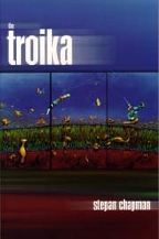
This truth had been put to the test during the long, intense, painful promotion of Stepan Chapman's The Troika in 1997. That campaign may have defined my own career, as well. With my friend Tom Winstead, an Alabama businessman and writer, funding The Troika and helping with PR, the Ministry managed to sell thousands of copies of an incredibly idiosyncratic if brilliant surreal SF novel, and help Chapman win the Philip K. Dick Award in the process. There were times during that year when I found myself suddenly bursting into tears out of stress, it was that intense. But what I found out in the world of readers and booksellers was the same thing I had found while writing "Dradin" by myself in my office: if you keep pushing, good will come of it, and even a reversal of fortune can lead to something positive if you just keep your wits about you and make it so. The dual experience of living this knowledge as a writer and as a book publisher/editor/promoter is probably the only thing that kept me sane during the months it took to make the hardcover City of Saints & Madmen a reality.
And yet, I found myself gripped by an obsession, an addiction, due to the tremendous opportunity that lay before me. Because of the low start-up costs of POD, Sean Wallace didn't mind if I added more stories to City of Saints. (He didn't mind at first, but when the book became twice as long as it had been, he minded, although by that time it was too late.) He also didn't mind if I added art inside, so long as it didn't cost him extra. (I wound up paying the artists out of my own royalties; but, true, Sean was under no obligation to add artwork to a book that he was already losing money on due to Imaginary Worlds' screw-ups.) Even more important, he didn't mind my working directly with the designer to create the book. How could I pass up this opportunity? The Catch 22, the irony, is in retrospect delicious: I could have total control, could basically do whatever I wanted--and yet, how could the book in my head ever be matched by the book that would make it to the printed page, given POD's limitations? Would the result be like some microfiche facsimile copy of a book all of whose actual copies had been destroyed long ago by wear, tear, and time? From the first, I was in denial about POD's limitations. I simply did not acknowledge them. This was the lesson I had learned taken to the level of folly. There was now a book in my head that hadn't been there even three months before--I could see it, every page of it, every nuance of the layout--and even if Lightning Source couldn't print it that way, I was going to create it that way. So, for six months, I worked with Garry Nurrish, the lead designer, to make a book that might never look good except in a PDF file. New Content: "The Cage"
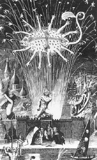
"The Cage" had been giving me fits for a long time. A few years before, I was at a bar mitzvah party and, suddenly turning, I looked up and saw on this distant ledge/shelf, high up toward the ceiling of the building, an empty cage with iron bars. It was incongruous--nothing around it fit. It didn't look like it belonged at all. The question that immediately came to me and which raised the little hairs on my neck was: "What's inside of it?" I don't know why I thought that. But although the cage was empty, it didn't seem empty somehow. Immediately I was one of the first Hoegbottons, the Ambergris merchant clan, looking up at the cage. I was in a mansion. Something terrible had happened or was going to happen... The idea was there, but I couldn't write my way to it--all the drafts of first scenes were horrible. So I shelved it. A year later, on a vacation to Tampa, my then-fiancée Ann and I stopped at the University of Tampa, which used to be a lush, lavish 1920s hotel. Inside, in one of the rooms, was a collection of old tables, chairs, grandfather clocks...and a cage. In that atmosphere, after hours, the place like a more opulent hotel from The Shining, again, the cage seemed to contain something even though empty. This time, the idea stuck. Just the image of it. Another year passed. I couldn't write it but wanted to write it. I still couldn't find the right entrance to the story, and now I felt like I had to find that entrance quickly. For one thing, it might take me years to place another long novella in a magazine market, so putting it into City of Saintswas very compelling for that reason. For another thing, the story gave more details about The Silence, an event that readers of "The Early History of Ambergris" had been very keen on learning more about.[4] I also knew--and this was the most important reason--that if I didn't finish it soon, I'd never finish it. There comes a point in the process of mulling over any unfinished story when a glowing expiration date label begins to appear in my mind. The impetus, the emphasis, for the story begins to wither away.
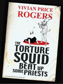
I did shop "The Cage" around to a few places, most notably Gordon Van Gelder at F&SF, whose "excuse" this time was that he'd received two or three pieces very much like it in recent weeks. Considering the fate of "Transformation of Martin Lake" after his rejection, I thought "The Cage" would do very well indeed. It made a few year's best lists after publication in City of Saints, as it turns out, and Stephen Jones took it for his Best New Horror #14 year's best anthology. " King Squid"
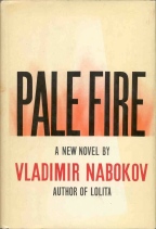
However, "King Squid" would also resolve an issue I'd come across after writing "The Early History"--in fact, Thomas Ligotti had pointed it out to me. [5] Despite the subtext of Duncan Shriek, the supposed author of "The Early History," having fallen in love with one of the historians he quoted, Mary Sabon, the restriction of the form meant that the reader could not become emotionally involved in any particulars of Duncan's life. In the obvious parallel, in terms of structure, Nabokov's novel Pale Fire made the narrator's life one of its main storylines, allowing for that emotional connection.
I knew I wanted the language in "King Squid" to be pompous at times, over the top, and antique. So I bought a couple of books on antiquated words, extracted the most insulting ones, and used them for Madnok's attacks on those who spurned his father's theories. Since my father is a scientist--he studies fire ants--I channeled and made more outrageous/melodramatic some of my memories of his research in the descriptions of Madnok's father. It also became clear early on that the monograph was going to need a bibliography of books about squid, and that the annotations to the bibliography would advance the story. To speed up and diversify the squid book list--which wound up being about 24 pages long--I turned to the loyal subscribers to my monthly VanderWorld e-newsletter. Not only did I solicit titles from them, but I also used disguised versions of their own names as the authors of those titles. Thus, for example, China Mieville snuck into City of Saints, albeit incognito, as "Vielle, C.M., Naughty Lisp and the Squid: A Polyp Diptych." Compiling the annotated bibliography took almost as long as writing the main part of the story. The arrangement of the annotations, the re-editing of author names so that the titles fell in the proper order, the re-writing of some annotations, all accreted over a period of a few months. When I was done, I immediately sent it to F&SF for the official benediction of rejection. " 52:5:13:5"--45:6:1:1 21:8:2:13 42:4:8:4 43:7:1:7 19:4:9:2 21:3:3:6 22:3:11:6 37:2:8:1 Most of the other stories in the Appendix section of the book took very little time at all--"In the Hours After Death" is my take on the Decadent-era fiction of France and England, while I adapted "The Hoegbotton Family History" from the recorded accounts of my wife's family moving from Dubrovna, Russia, to the New World early in the 20th century. "The Man Who Had No Eyes," or "the encrypted story," however, took more effort than "The Cage" and "King Squid" combined.
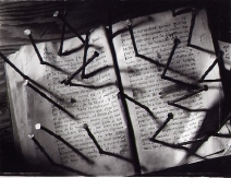
At first glance, the encrypted story seems like a typical Oulipo trick. However, whether consciously before writing it or unconsciously while writing it, it became something more than that. The encrypted story has to do with concealment, with a dual need to reveal and hide, and thus mirrors "King Squid" in some ways. The encrypted story can be deciphered by referring to the first four novellas in the book--the number series in the encrypted story map to words in those novellas. What was the point of such an exercise? First, it is important to the frame/plot of the new material. Second, the reader gains the experience of actually writing the story, word by word. The effect of decryption also slows the reading of the story, making each word have more weight, an effect usually specific to poetry. The sting in the tail of the decrypted story frees the reader to take over the author's role on a permanent basis. The intent is to liberate the reader from the author's manipulation, in a sense.
The encrypted story probably shouldn't have been as long as it was mainly to avoid the possibility of both my wife and I going insane. Originally, I meant for "The Man Who Had No Eyes" to be part of an unfinished Ambergris novel Fragments from a Drowned City, but it didn't fit there. I then meant for it to be the cover story for the hardcover edition, but it didn't provide the right introduction to Ambergris. Finally, when I needed an encrypted story, it fit perfectly. Well, not perfectly, but it fit. The problem was, I had to do the encryption after the first four novellas had been completely copy-edited and proofread, so that the position of the words would not change. But this also meant that if words in "The Man Who Had No Eyes" did not appear in the first four novellas in City of Saints, I would have to substitute words to replace them. This process took awhile, but not as long as it could have, because I was working from a PDF file of the first four novellas and thus could perform a Search for each word. Still, it took an irritating amount of time, especially because I was determined (obsession coiled within obsession) to get the right emotional context for the word transfer. Thus, I would consider seven or eight positions of the word "the" within the main text before deciding which one would be airlifted into the encrypted story.
My enthusiasm was tempered when I realized the encryption would have to be proofread--i.e., decrypted--and then the proofread checked and double-checked. Long-suffering Ann volunteered for the decryption part, and then I had to go behind her and check it. The whole process took something like 150 hours, possibly more. It required a jeweler's precision, and tested our proofreading skills, and yet we still missed a few of my encryption mistakes. (Since corrected in the new editions, but only with the help of three intrepid volunteers.) I remember working late nights on the proofreading of those numbers, aware that the deadline for completion of the book was beginning to loom, having lost all perspective on why I was even doing this. After all, how many readers would actually decrypt the story? Was it really necessary to the integrity of what I now thought of as "the Appendix"? I'm not sure I ever answered that question to my own satisfaction. Still, it was a memorable experience, and one that gave me the perspective and stamina to later attempt The Thackery T. Lambshead Pocket Guide to Eccentric & Discredited Diseases. And, even though only about 30 readers have told me they attempted the decryption, the whole process of encryption and decryption taught me so much about the use of language, as I've expressed above, that on a purely selfish level, it was worth it. At the same time, I've vowed never to write an encrypted story ever again. I considered sending the encrypted version of the story to F&SF, but I thought it best not to give Gordon, who was always very kind and prompt with his rejections, an excuse to haul off and hit me at some convention or other. Art and Design: A Cast of Thousands
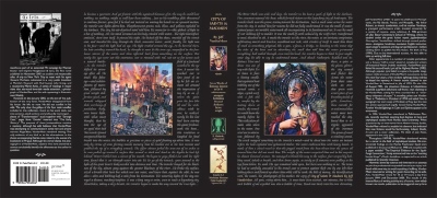
My main conspirator in this insanity was designer Garry Nurrish, editor of Redsine at the time, who lived in Australia. He had a Web design background and had been typesetting Prime books for about a year before the City of Saints project. Garry would later help bring K. J. Bishop's The Etched City to Prime in his editorial capacity, and design the beautiful England-based fiction magazine Nemonymous. Garry and I worked well together because he was willing to try whatever lame-brained idea I asked for, while bringing his own ideas to the table as well. He also put up with my endless quest for more iterations of an idea or visual concept. By the end, we had exchanged over 2,000 e-mails, half of them frustrated variations on "that didn't work!" or "POD won't let us do that!" We were both in the trenches, trying to stop a series of flash floods from drowning us. Without Garry's stoic willingness to get up each day and yet again tackle a project rapidly spiraling out of control, City of Saints would have been doomed. [7] What did Garry have to work with? In addition to the words and my general layout ideas, he had visuals to fit into the interior. The artists and illustrators for this Force 10 From Navarone project were: Scott Eagle, an art professor at East Carolina University who had a penchant for taking a power sander to his work to create texture and who had meticulously copied the Old Masters as part of his learning curve, while also incorporating lessons learned from Dali and Jackson Pollack; Mark Roberts, a professional graphic designer with a Website emphasis who lived near London and ran his own design firm called Chimeric; Eric Schaller, a University of New Hampshire plant biologist who created creepy and sublime line art on the side and also wrote fiction, with one piece snapped up by The Year's Best Fantasy & Horror; John Coulthart, Manchester, England, designer of album covers for Hawkwind and Cradle of Filth, as well as the designer of Savoy Books' marvelous line of collectibles, including The Adventures of Engelbrecht; Dawn Andrews, an experimental artist and member of a writer's group called Storyville, who created "book fetish" pieces; and Dave Larsen, an employee for John Deere, genre convention costume contestant, and a knife-maker, who actually made a mushroom dweller knife and took a photograph for the collection. The contrasting styles of the artwork helped to create verisimilitude with regard to the fantasy setting. In some cases, an image sparked a new story or other text--I found riffing off of their art very satisfying.
Still, all of this made Garry's job especially difficult--consolidating all the visuals flying at him from all over the place, finding ways to incorporate it artfully, and still sticking to the general design ideas I'd presented to him. He also had constraints that might have been irritating to someone less secure--I insisted on using the Caslon typeface for the first four novellas in City of Saints because Nabokov's Pale Fire in the Everyman Library edition had used Sabon. I insisted that every piece in the Appendix purport to be a different artifact from Ambergris, requiring a different font and design. In addition to all of this, Garry had to help coordinate with the other designers, in part because of his software. By the time that Garry realized his antiquated Ventura desktop publishing program was unstable, it was too late--he'd already done too much work on the book. Ventura hated footnotes. Not only did it hate footnotes, but it created problems with the encrypted story because if there was a minute change in one place, it might throw off the line breaks in the first four novellas, affecting the entire encryption. So, for "The Early History," we turned to Robert Wexler, a writer and designer who handled the footnotes. We also brought in Coulthart, a man with over twenty years of design experience, who would later help create The Thackery T. Lambshead Pocket Guide to Eccentric & Discredited Diseases. While writing "King Squid," I had had Coulthart in mind because his sometimes pseudo-Victorian style fit the subject matter perfectly. Slowly, throughout the fall of 2001, Garry and I worked on the book, with the content more or less finalized, except for a series of copy edits on my part. By this time, the book had become my life. Besides my day job, I had no life besides the book. I was knee-deep in the production of the book. There was no aspect of it that I had not become involved in. Pre-production Problems
Once I'd stolen the text from the beginning of my unfinished Ambergris novel Fragments from a Drowned City and given it to Garry to use, the fun began. The problem with running the text around the cover image included bad spacing around certain words and, because of the flourishes in the font, issues of uneven spacing between the image and the text. Even with a strict full-justified margin to either side of the image, the text appeared to crowd the image more closely on the left than on the right. Also, questions of readability arose. The reader would have to scan across the cover art, when it might seem more natural to interpret the text to right and left of the art as two separate columns. Over a period of weeks, all of these problems were eventually resolved, although not without a lot of cursing and consultation with other designers. Ironically enough, a Flann O'Brien nonfiction collection retroactively solved the whole problem in 2003, right before finalizing the Wildside Press trade paperback. The O'Brien cover ran the artwork in a strip right across the middle of the page, with text above and below. Eureka! This was a better way to do it that resolved all of the problems. That Garry and I hadn't been idiots in the first place regarding our difficulties was driven home when the Pan Macmillan designer tried to replicate the original U.S. hardcover cover and finally went with the same solution we'd come up with for the Wildside trade paperback. Of course, we had another problem before we even went to press: What to do about the photographs? They would definitely reproduce badly. They might, in fact, look like black squares of blackness, smudged and unknowable. So, with the help of Mark Roberts (who was already moving irrevocably toward his own doom by agreeing to co-edit the fake disease guide with me), Garry tried his best to use file formats and Photoshop tricks to make the photographs reproduce less hideously. In fact, our test was, if I printed it out from the PDF file and photocopied it at Kinko's, did it look okay or did it look like crap? Because, as Sean informed us at some point during the process, Lightning Source didn't use metal plates or even paper plates--they used a glorified photocopy machine. Finally, everything was in place. The book was ready to go to Lightning Source for a test run. A proof copy would be run off and sent to me for review. This was the moment of truth. It was now mid-October and if the damn thing didn't look good, then we might as well forget about the book coming out in 2001. I was acutely aware of the stupidity of a hardcover of a book coming out after the trade paperback, but every pore on my body screamed out against the stupidity of a hardcover coming out the year after the trade paperback. The Horror of the Proofs
I called Sean about it. "That's just the proof copy--I think the final copy will be different," he said. "Are you sure?" "No." "I think you'd better make sure," I said in a bloodless voice. For the better part of an hour, I had been going through every page of my beloved book, finding abomination after abomination. Eric Schaller's illustrations and drop caps for the novellas had quite a bit of black ink in them, but they were not photographs or paintings--they required nothing more than the kind of reproduction inherent in a good photocopy. And yet, the black ink in the illustrations had smeared or, in many cases, printed unevenly, so that daubs and hazes of white-and-gray broke the smooth surface. In short, they looked like bad photocopies. I remember that Eric had, some months earlier, said, nonchalantly, "Don't worry--they're just line drawings. They can't mess them up." For the title pages for "Dradin," "The Early History," "The Transformation of Martin Lake," and "The Strange Case of X," Garry had used black-and-white blow-ups of parts of the front cover art by Scott Eagle with boxes overlaid for the text. However, the page proofs from Lightning Source soon revealed that Eagle's art would reproduce like an Andy Warhol reproduction-of-a-reproduction-of-a-photocopy. The photograph of Larsen's knife was too horrid to look at for very long. The photograph of Andrews' artwork came out as a muddled jumble of cacophonous black and gray. The black backgrounds Mark had used to frame his fake book covers served as tombstones for his otherwise magnificent work. Even the text itself came off as light and grainy. In short, disaster. Was any of this unexpected? Actually, yes, it was; no matter how much I'd been told about print-on-demand publishing, I hadn't expected that even line drawings with a lot of black ink would look bad. I hadn't expected that the text would be too light.
It looked like we would have to minimize the potential problems and hope for the best. It looked like I might have just spent six months of my life (and, really, nine years before that) on a project that would be the Heaven's Gate of the indie publishing world, assuming it ever got printed. The only good news? The cover had printed perfectly. It looked wonderful. If nothing else, I could look forward to taking the cover to book readings and signings, even if the book itself never put in an appearance. Solutions
But, eventually, Garry and I started working through the issues. The main issue concerned the proofs. It still wasn't clear from talking to Lightning Source whether the finished book would look as bad as the proof copy. Sean told me LS had seemed to insist that the finished copy always turned out better than the proof copy. ("What's the point of doing a proof copy, then?" I asked, with no response.) We went back and forth on what to do, and wasted time with indecisiveness. If the illustrations had to be redone, it meant many more hours of work. The decision couldn't be made lightly. The obvious question, however, never got asked. There wasn't a single point that I can remember where I, or Garry, or anyone, asked whether the best solution would be to just ditch the photographs and illustrations entirely--perhaps because, after all of that work, it just wasn't thinkable. Sean later confirmed that "too much work had gone into it. Still, I thought about removing your thumbs or hiring a hit man to whack your kneecaps. Jumping off a high pier was another thought that occurred to me." We were so deep in the trenches now that we couldn't see the sky. While all of this went on, Ann and I traveled to the Slipstream Conference in LaGrange, Georgia, where Scott Eagle was one of the featured guests. I went there armed with the crappy proof copy of City of Saints and a flat of the cover. I had hoped to have the finished book, but, of course, there was no chance of that. In fact, when people looked at the proof, I had to say, "That's just the proof for purposes of checking the text. The illustrations don't look very good in this version." When, of course, the truth was that they were looking at what amounted to a final copy of the book, a fact I couldn't bear to reveal. Still, regardless of my efforts, I made a sorry sight at the book signing after the slipstream panels, holding my proof copy in one hand and my cover flat in the other. I'd already had a weird enough day, completing a story ("Secret Life") while in the audience during someone's reading, the sudden aberrant thought that Andy Duncan might have stolen my pen fueling my inspiration. "Too bad the book wasn't ready for the conference," James Patrick Kelly said. "Yeah, too bad," I replied. Meanwhile, at that very moment, in Australia and England, New Hampshire and Florida, men and women worked feverishly to overhaul City of Saints' visuals so that it could become…a book. Success?
Still, progress began to be made, slowly, surely, and then, finally, the book was at Lightning Source again, to be processed and made available to readers who would never (until now) know what had gone into its production, or care (until now?). We had decided on a half-measure--adjusting the pixilation settings on the existing illustrations and hoping that they would turn out okay. We were still not sure that this would work, but another proof copy was not an option this time--we had to go to press. All of those people who had pre-ordered the Imaginary Worlds' edition might have believed me about the collapse of that press, but now that it seemed like a decade had elapsed since they'd ordered it, their patience was wearing thin--among those who even remembered having ordered it. It is indicative of how chaotic everything had been that the last pre-orderer didn't get her copy until the book release party for the fake disease guide in 2003. Besides, the damn book needed to come out so I wouldn't lose my mind. It appeared I would have copies in time for the ICFA conference in Ft. Lauderdale. Then it appeared I would not have them in time. Then it did. Then it didn't. I finally wound up in Ft. Lauderdale with a frozen/crazed grin on my face, walking up to China Mieville with just the cover flats. I kind of shoved it in his general direction like some kind of lunatic. "See--it is real. It does exist…" In addition to dealing with all of the mess surrounding City of Saints, I was also planning an out-of-town wedding to my fiancée Ann--we were in Ft. Lauderdale primarily to check out reception locations and meet with the rabbi. Ann's parents lived in Ft. Lauderdale, so I was dealing with future in-laws, with wedding plans, with problems associated with the book, and just in general living a life of constant stress. It was not a happy time. [8] On the last day of the conference, while talking to Kelly Link, she asked where she could find the hardcover City of Saints. "It's not out yet." "That's a shame," Kelly said. "Yes. Yes, I know," I said. We were almost there, but not quite. The "Latest Version" and Pre-publication Publicity Meanwhile, as the book inched its way toward publication, the initial PR for the book had begun, consisting of trying to get interviewed on Webzines and suggest City of Saints-related articles to magazines, but mostly of getting advance galleys to those who needed them--in this case, specifically Peter Cannon at Publishers Weekly and Claude Lalumière at Locus Online. Sean, at great expense, had two bound advance copies made, with cover flats, and sent them, with the press release I had written, to PW. They promptly disappeared from the PW mail room. Sean only found out about this when he queried Cannon about the advance copies. He was told they had been in the mail room, but then they had disappeared.
Engaged in the last throes of overseeing the book's preparation prior to printing, I greeted this news with a couple of choice Anglo-Saxon words. But on one level, I could have cared less. I had just received copies of the final, printed book, and the illustrations looked just as bad as they had in the proof copy. Over the next few days, I sent an emergency email to John Coulthart and he worked on replacement title pages that would reproduce like line-drawings, his solution incorporating tiny thumbnail pieces of Eagle's cover art. At the same time, just in case, Eric Schaller worked on replacement line drawings that did away with the solid black of the originals. Mark Roberts agreed to drop the black backgrounds from his fake book covers. Garry worked to again lighten the remaining photographs. John didn't need to do anything for "King Squid"--it looked reasonably okay. Meanwhile, Dawn Andrews agreed to…well, there was nothing for it on Dawn's piece but to come up with the most devious solution of all--I changed the title of her piece to indicate it was a "badly damaged photograph" recovered from the gray caps' lair. That way, it could look like a black cat threw up a hairball onto a black carpet and it wouldn't matter. Sean continued to deal with the problem of disappearing review copies. He had sent PW two more copies, but these copies also disappeared from the mail room--"stolen" as Sean and I, both paranoid, put it. Sean sent another copy. It never arrived. A couple of weeks had gone by. The book still wasn't out and the proofs still hadn't gotten to PW. It was looking like it would be less expensive and faster to just take a train to New York City and deliver them personally. Finally, Sean managed to have another set of copies made, and this time sent them to Cannon's home address. They arrived. They did not disappear. However, a similar problem was occurring almost simultaneously with The Washington Post Book World, except in that case the proofs only disappeared once or twice. But this had unexpected consequences for Eric Schaller, to whom I had sent a couple of the finished copies of the (terrible-looking) book. The Post needed copies. We didn't have any copies. The Post needed copies. We didn't have any copies. So, finally, I called up Eric and I asked if he could send his two precious copies to The Post. The contact at The Post had promised they'd be returned to Eric. "Well, if you're sure," he said, hesitantly. "You did sign these to me." I felt terrible, but I told him he didn't need to worry. "Okay, if you say so," Eric said. "It's no problem. The Post says it'll return them." Of course, just to make me a liar, The Post never returned them. Not only that, but in a delicious irony Duncan Shriek would have appreciated, the review of City of Saints in The Post made mocking comments about inconsistent fonts, lack of page numbers, and irregular layout, meaning we would have been better off sending the original trade paperback for review. Poor Eric's two copies had been worth, potentially, more than any other edition or iteration of the book, since Prime only produced 10 or 20 copies. Of all the sacrifices made during the project, I think Eric's might have been the most selfless, although he has been known to remind me about it. Still, at the time, all we knew was that the review copies had finally reached their destinations. We scrambled back into production mode to finish off the last recalibrations before the book went to press… At Last
I know I felt relief, a sense of peace, because even if no one reviewed it or bought it, I still had accomplished what I had set out to do. I felt a bit of triumph, and a bit of sadness because of all the things I'd sacrificed to do the book--family time, my physical fitness, and much else. Ann had been there the whole way, helping out, keeping my spirits up, providing solutions. And I felt just a hint of melancholy, because even after all of those efforts, even after the wrenching dislocation required to retool the book after receiving the proofs, it still wasn't quite the book I'd imagined in my head. POD printing could make a book that mimicked any commercial press book out there, if you knew how to finesse its liabilities. But, in terms of the materials used, it couldn't really make an elegant book. The front board was of unadorned gray. The spine of the boards said simply "CITY OF SAINTS". The binding and the paper were sturdy, but uninspired. Inside, the illustrations still sometimes looked suspect, and sometimes, too, the text still looked too light. The idea and execution of the idea still shone through, but the interface used to express them was not ideal.
Most of this was in the future. At the time I held that first copy in my hands, though, we were now entering the most critical phase of a book's life--the push for publicity right before and right after the initial publication date. There was work to do. First, though, a very patient woman was waiting for me to marry her. Publicity
For the rest of 2002, I pushed City of Saints like a drug dealer pushing crack. I personally sent out hundreds of copies to reviewers, spending thousands of dollars. Sean had thus far been unconvinced of the necessity of sending out review copies--he sent out only twenty of his own volition. We had some rather long arguments about this issue, but it wasn't until the end of the year, when the sales figures had sunk in, that he began to understand the value of doing more than sending copies to a few media outlets. Regardless of our butting heads over the issue, Sean did allow me to keep buying copies of the hardcover at cost ($13 each) so I could saturate the market. From Bookmunch.co.uk to Infinity Plus, from Locus to The Independent Publisher, everyone got a copy. I sent copies to individual writers, to writer groups, to places that valued books as artifacts. I did interviews for all and sundry. I set up book readings and signings. I developed a multi-media City of Saints-related Rough Guide to Ambergris, since performed at venues as diverse as the World Fantasy Convention, the Walker Arts Center, and Trinity Prep School. When it was all over, City of Saints had sold thousands of copies for Cosmos and Prime, in the two editions--to this day, the book sells extremely well--the extended edition had been named SF Site's critic's choice of the year, both Amazon.com and Publishers Weekly had put it on their year's best list, and it became a finalist for the World Fantasy Award. Over seventy had reviews appeared, most of them raves, in such diverse publications as The Review of Contemporary Fiction, Locus, Rain Taxi, and aforementioned The Washington Post Book World. Eventually, Notre Dame University, among others, began to teach the book as part of contemporary fiction courses. Best of all, from my perspective, Peter Lavery at Pan Macmillan bought City of Saints early in 2003 for publication in the British Commonwealth. (Good words to Peter's ear from China Mieville, Liz Williams, and Mark Roberts certainly hadn't hurt its chances.) In the End... Which brings us back to the beginning, in a sense, with me holding a copy of the Pan Macmillan version of City of Saints. The definitive edition, with the original illustrations reinstated and new illustrations added, along with the complete text and illustrations of the previously chapbook-only The Exchange (with new commentary by "X") as well as the proto-Ambergris story "Learning to Leave the Flesh." I look at this book and, with deep apologies to Sean and Prime who took the original gamble on the book, I finally see the true fruition of my original vision. There is a sense of closure and a sense of real accomplishment. The thought of City of Saints on bookstore shelves from England to Australia, looking from afar like the monolith from the movie 2001, gives me great pleasure. What gives me perhaps even greater pleasure is something Garry Nurrish and I discussed just a week or two ago: that when we created this monster, we never realized it might do this well. We never really imagined a scenario whereby not only would a major publisher wind up buying it, but that major publisher would go with the original design, including the cover design. When I see "Cover Design by Garry Nurrish" on the dust jacket of the Pan Macmillan hardcover, followed by "Cover Art by Scott Eagle," I have to smile. Looking back, I want to say that I'm not sure I will ever have the mental strength to go through an experience like that again. But the truth is, most authors have some story of hardship to tell about the books they've published, even if my story represents an extreme case. I've also already relived variations on a difficult book birth with The Thackery T. Lambshead Pocket Guide to Eccentric & Discredited Diseases. There is something that I love about the totality of working on a book from start to finish, even a challenging book from a production standpoint. I can remember that even during the most depressing days of slaving away at City of Saints, I experienced moments of fierce joy and satisfaction in the work itself. Even the worst of it, I realize now, was the best of it. Some portions of this essay on "The Cage" first appeared in an interview conducted by Jeffrey Ford and posted on the Infinity Plus Web site. Some portions on "The Man Who Had No Eyes" first appeared in an interview conducted by Nicholas Gevers and posted on the SF Site Web site. |
|||||||||||||||||||||||||||||||||||||||||||||||||||
|
|